Iconography
The UX and Marketing team came together to create a new visual communication for the company.
Company
Ingresso.com is a Fandango company, part of the Comcast group, with over 20 years of experience in the ticket sales area in Brazil.
My role
Product design intern
Platforms
Web, App
Year
2020
How do we create the icons?
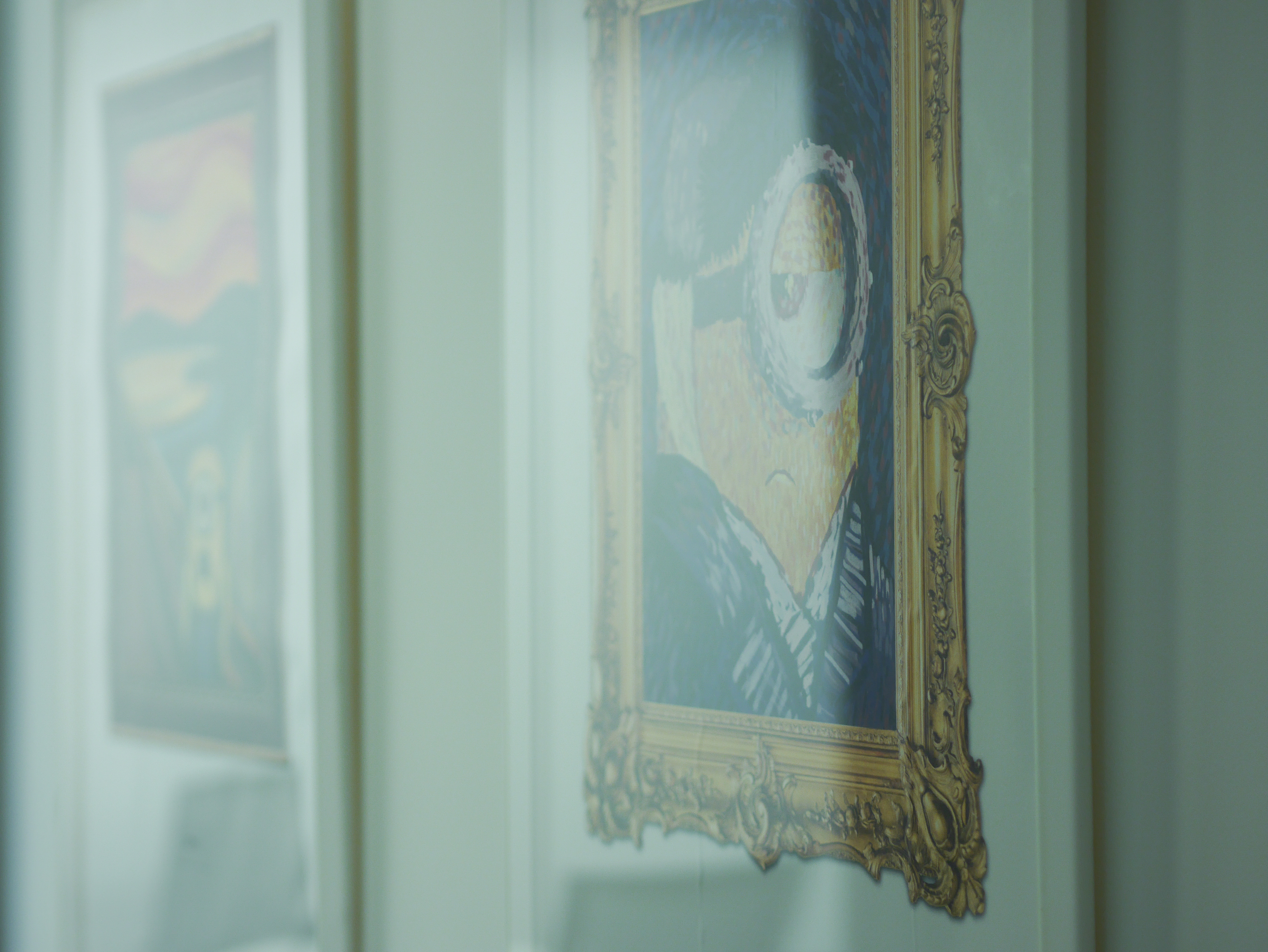
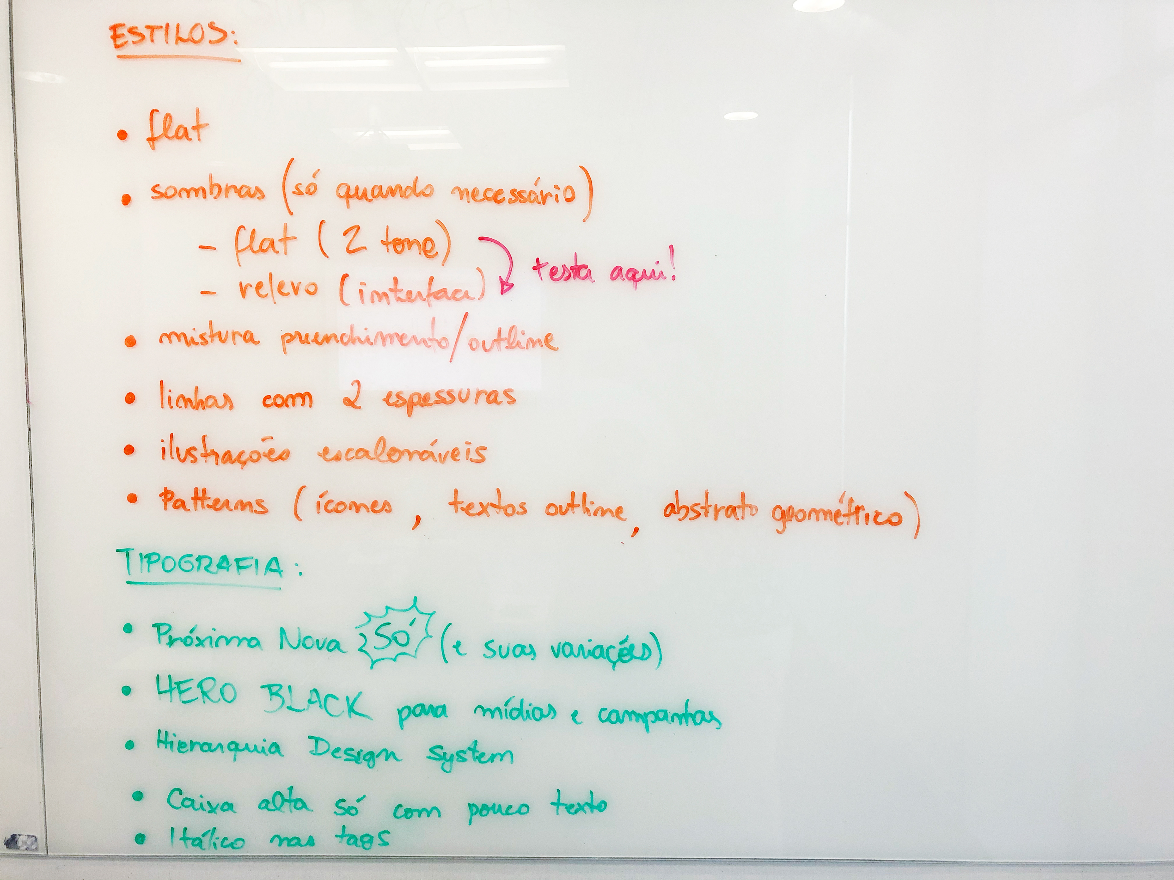
The style was designed thinking about integration between entertainment and communication that remained and was already known by many users in Brazil. The characters were created were that identification was part of the illustration core, mixing organic shapes, vibrant colors and both exaggerated and simetric forms. After a long process and hard work, the illustrations which were originally designed to renew the company's office, were the starting point to create a style guide within the existing design system, that have been defining new palettes, forms and animation.
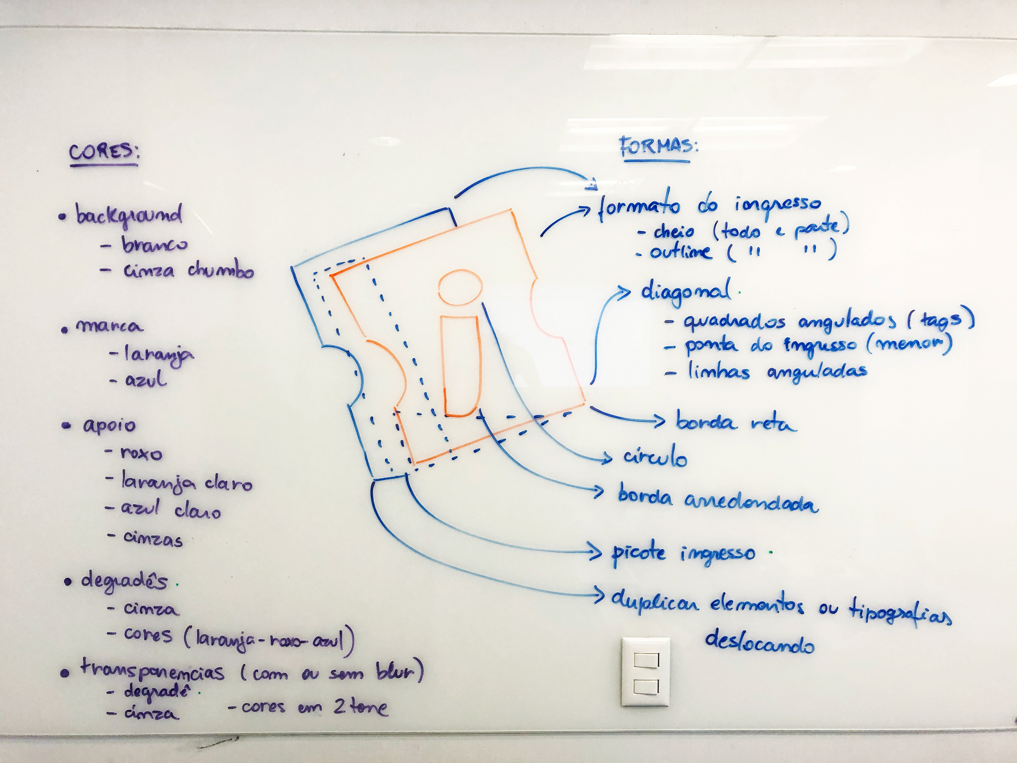
Icon grid and keyline
We used the grid according to Material Design, which states that the icon grid establishes clear rules for the consistent, but flexible, positioning of graphic elements. The circle, square, rectangle, orthogonals, and diagonals are universal and simple elements and have been developed to unify and systemize their placement on the icon grid.
Organic shapes and vibrant colors
The team have tried creating characters where that identification was part of the illustration core, mixing organic shapes, vibrant colors and both exaggerated and simetric forms. After a long process and hard work, the illustrations which were originally designed to renew the company's office, were the starting point to create a style guide within the existing design system, that have been defining new palettes, forms and animation.
First application
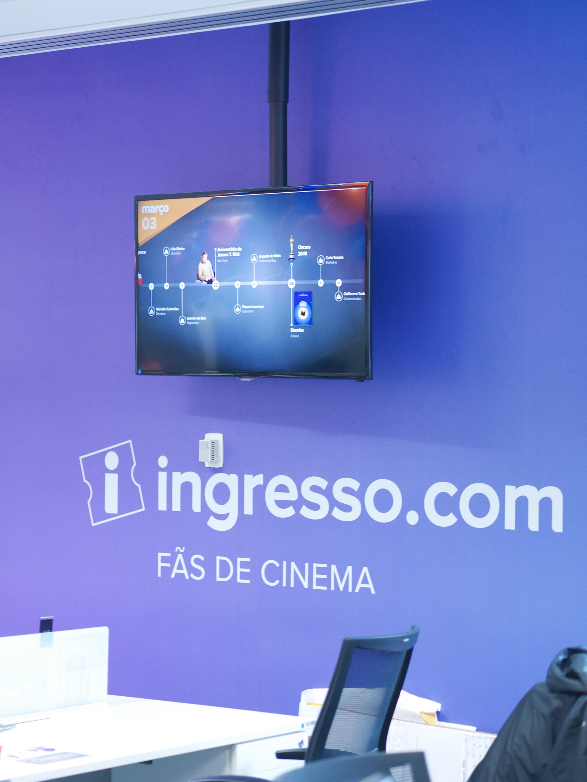
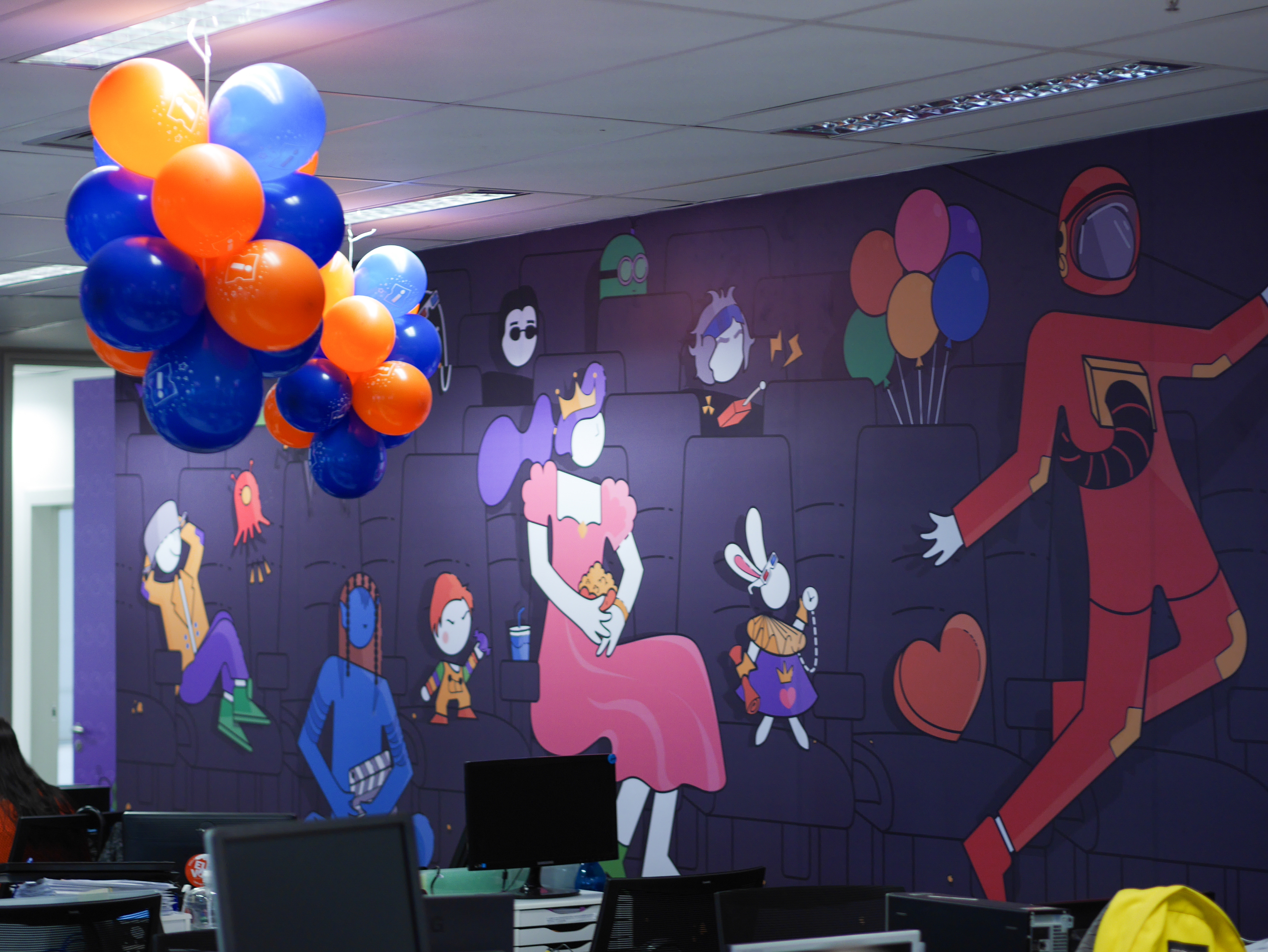
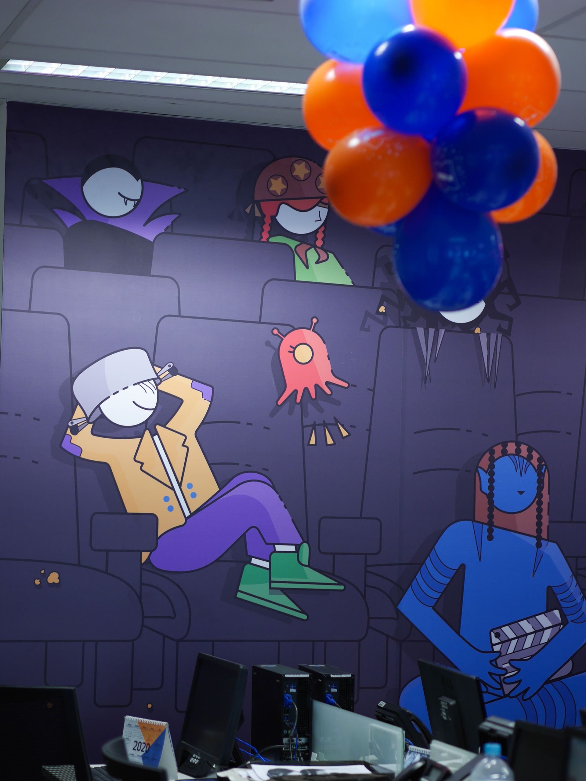
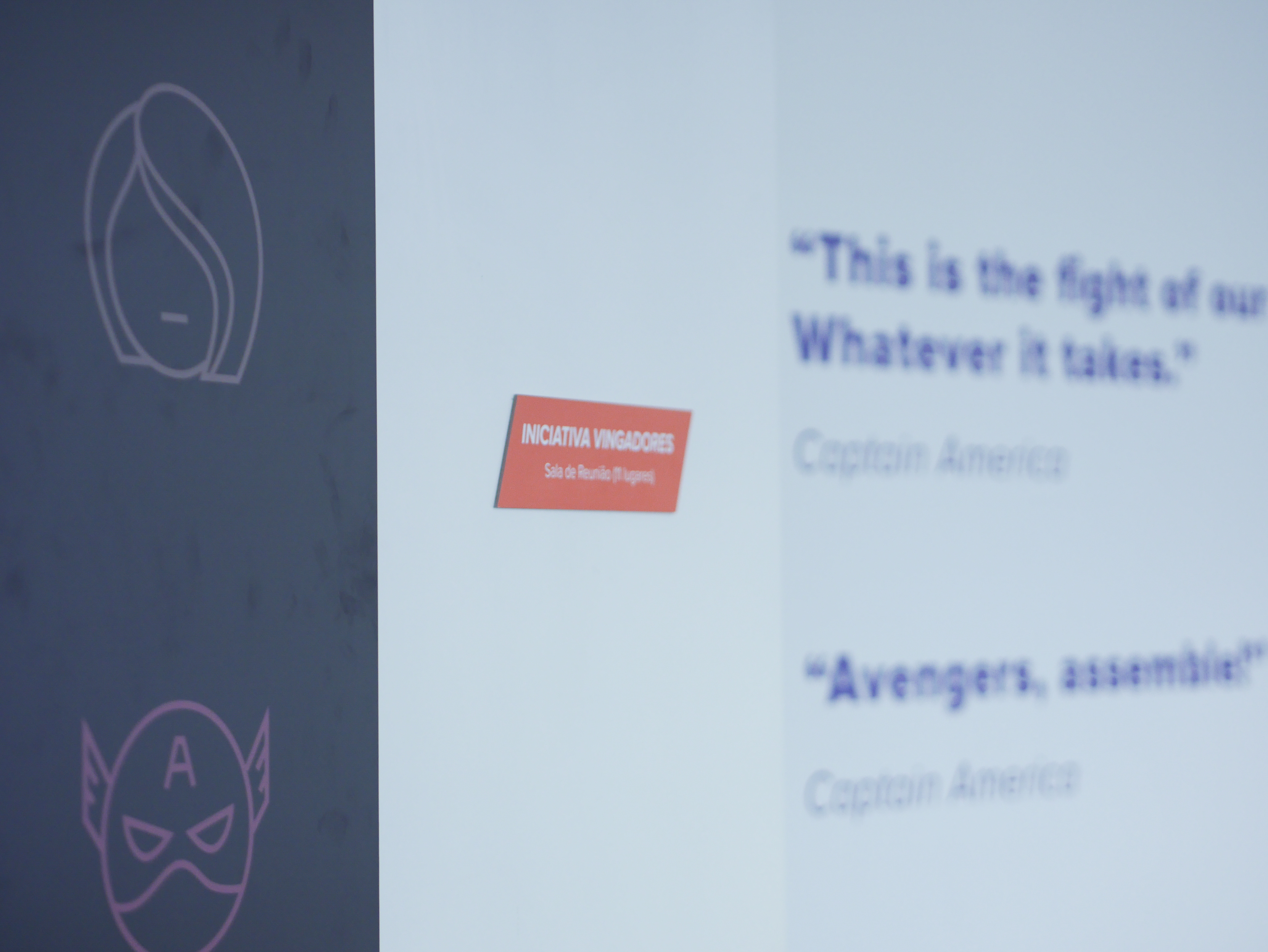
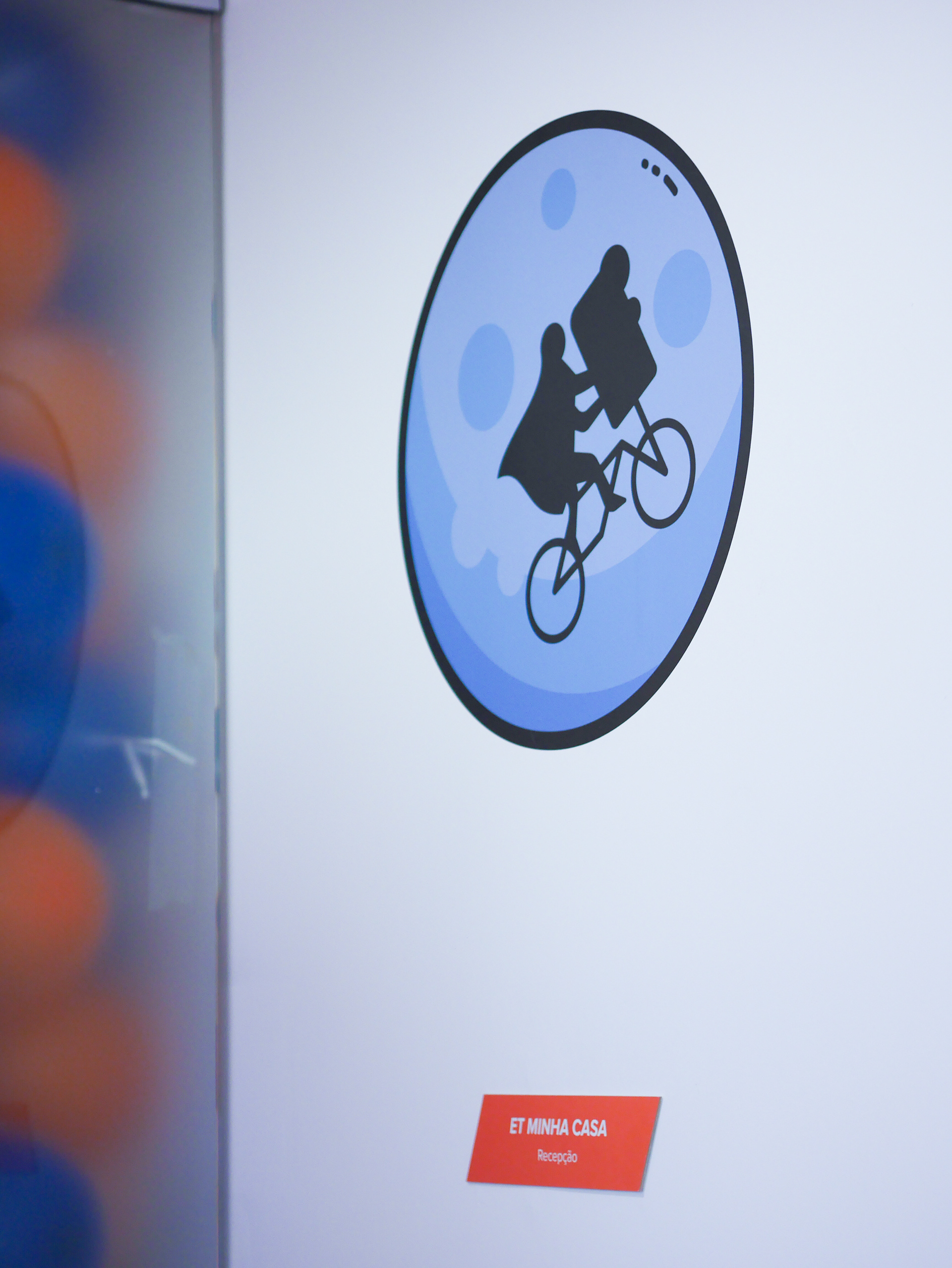
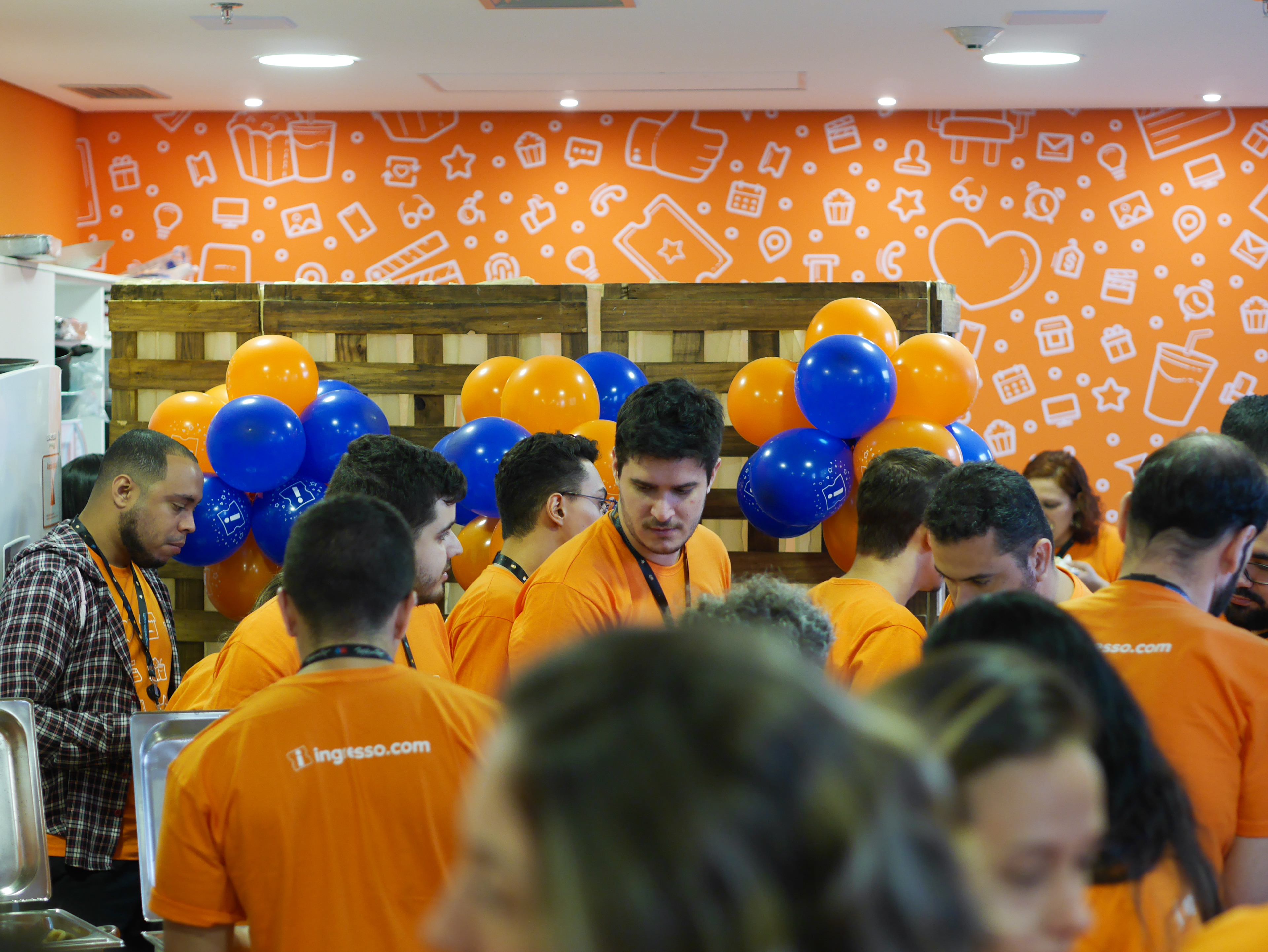
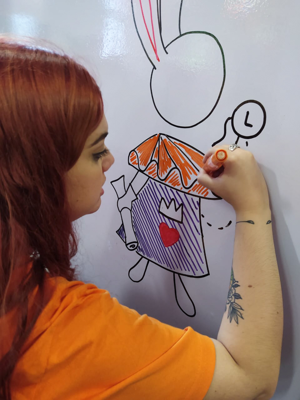
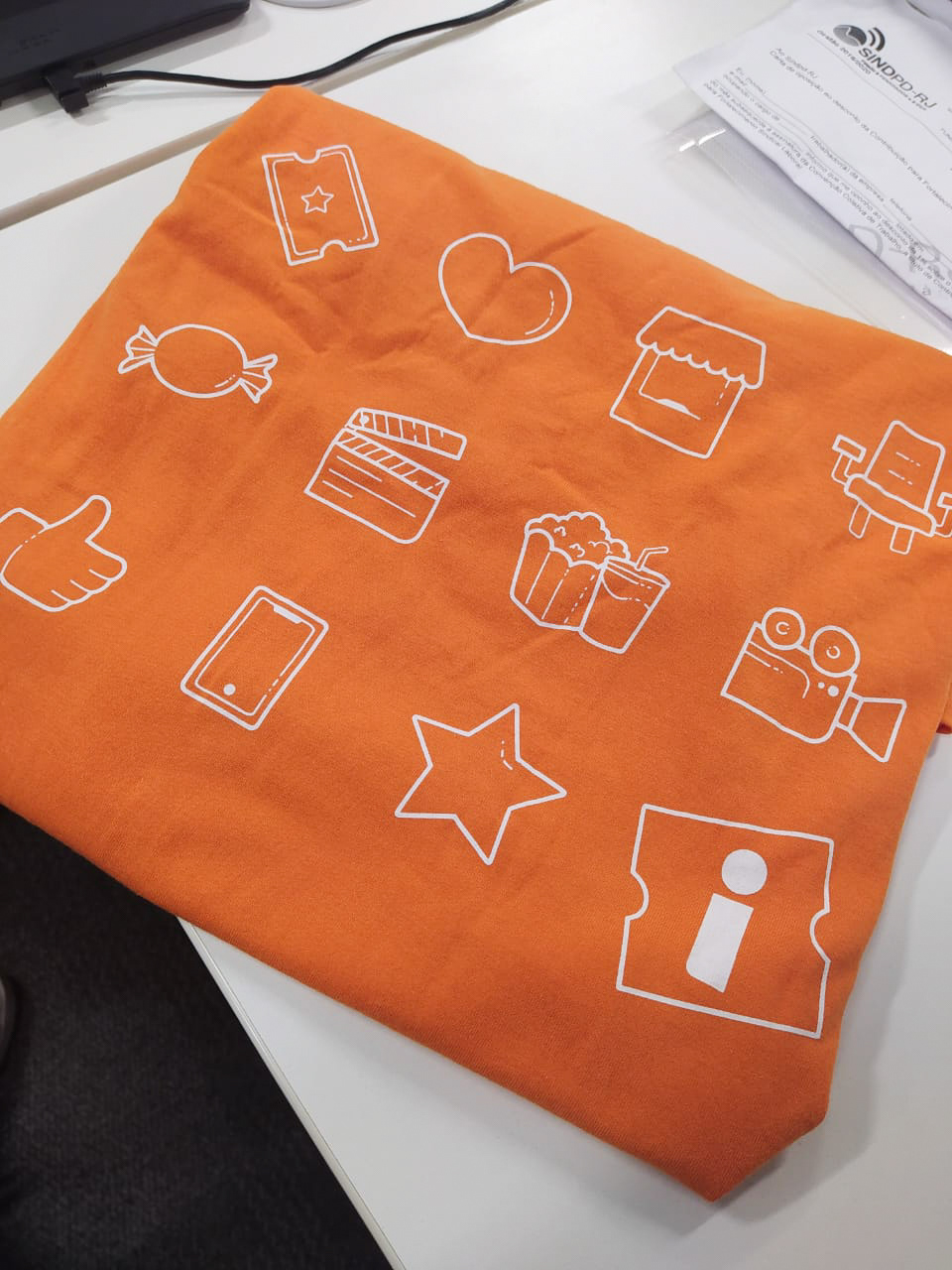
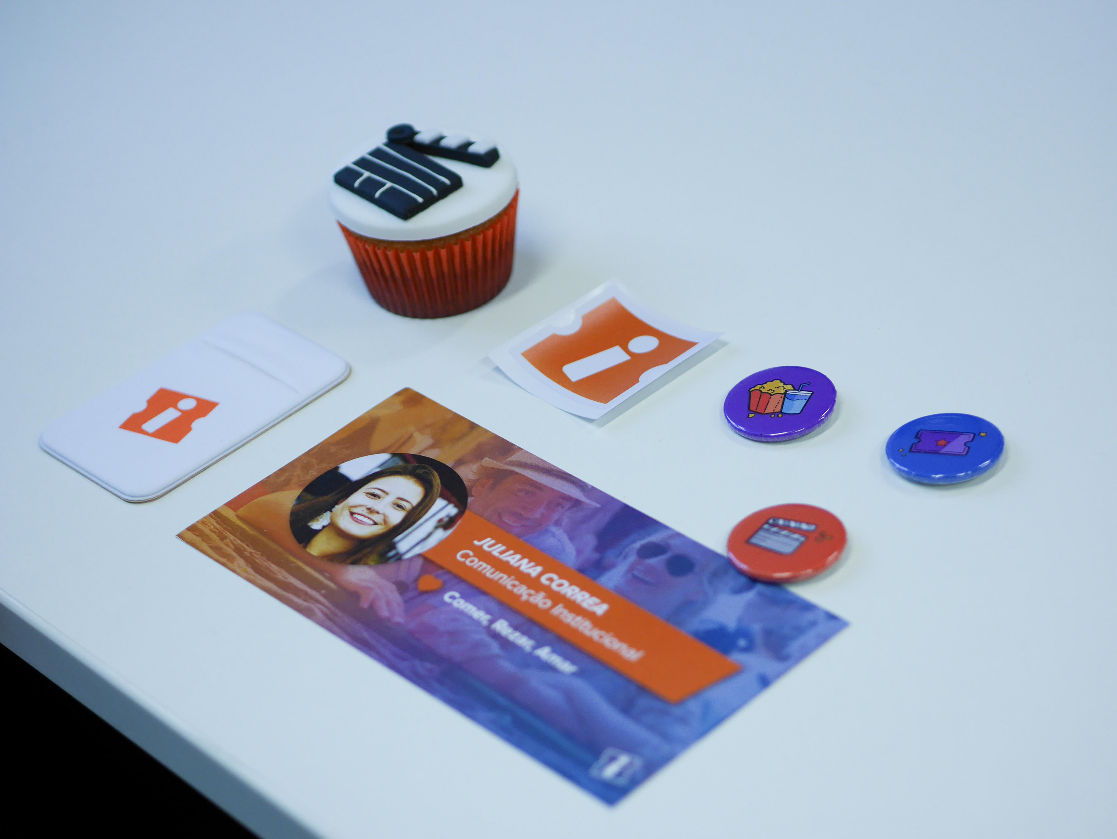
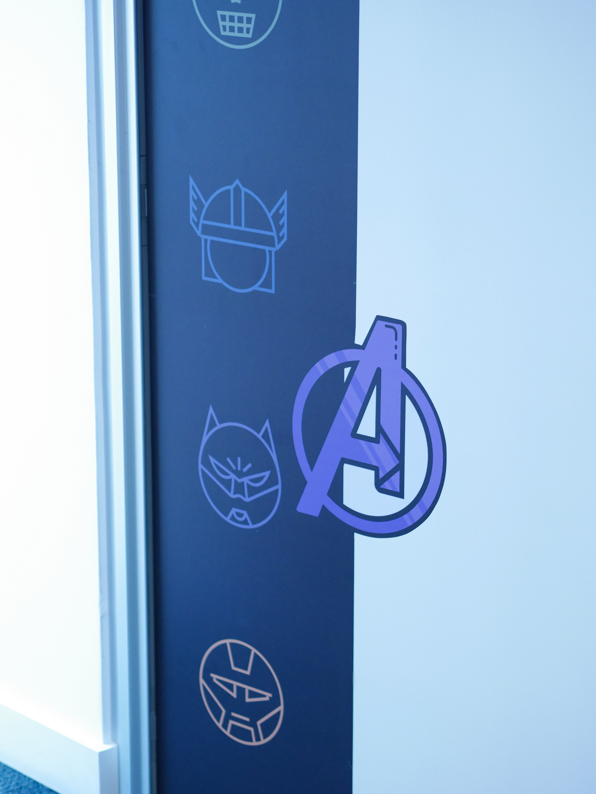
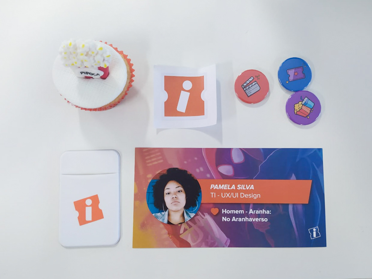
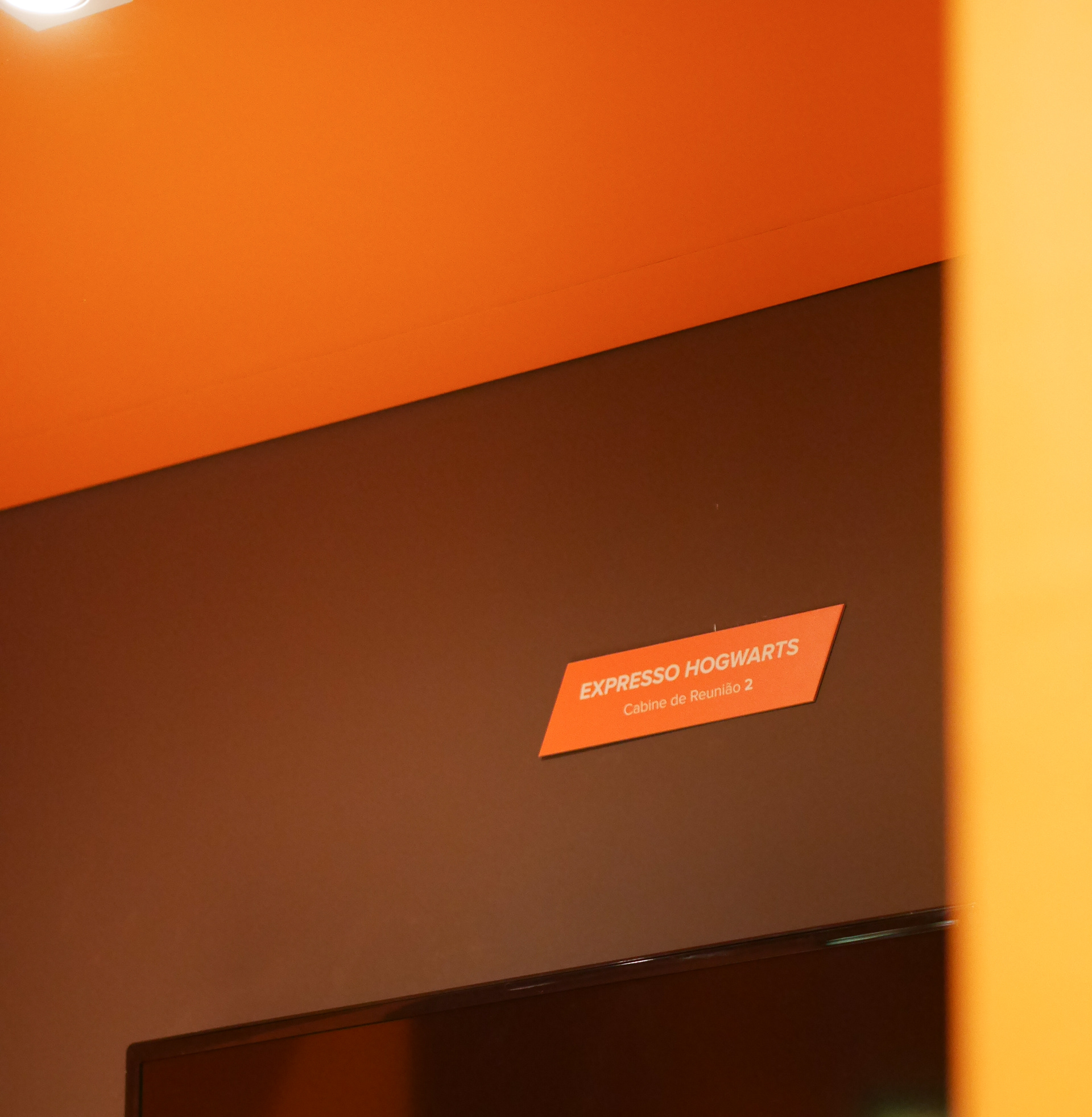
The first application we had the opportunity to do was in our office. Our icons and identity were used in the rooms's decoration and office signs. The environments were decorated according to the films previously voted by company employees. Each environment has its icon, pattern and phrase referring to the chosen film.


Interface application
Used to add context to interfaces, the icons, simple and illustrated are used to add warmth and help build an emotional connection, telling a story.
Iconography is a living organism that is constantly evolving, bringing to Ingresso.com products. The implementation of new UI has been cheered by company employees and clients.
Thanks!

