Photo by Alyssa Strohmann on Unsplash
Platform clarity and consistency
Merchants do not trust the promotions module due to its high complexity and lack of clarity about how it works. The current module is inconsistent with the new design system standards. Different experiences across the tool impact merchant confidence and hinder the platform's entry into the North American and European markets. The new experience proposes a cleaner, more intelligent, and more objective interface to ensure peace of mind for merchants.
Company
VTEX is an e-commerce platform that assists well-known brands like Carrefour and Samsung in managing their entire digital business, from catalog management to storefront updates.
My role
Product design
Skills
✦ Agile process ✦ Advanced knowledge of Figma ✦ Jira ✦ Amplitude ✦ SQL ✦ Amazon QuickSight ✦ Jira ✦ Confluence ✦ Notion ✦ Double diamond ✦ User Persona ✦ Blueprint ✦ User Interviews ✦ User Testing ✦ Prototyping ✦ Information Architecture ✦ Wireframing ✦ Responsive Design ✦ Accessibility (a11y) ✦ Design Systems ✦ Motion Design ✦ Microinteractions
In 2021, global ecommerce sales
grew 16.8% compared to the
previous year accounting
The global ecommerce market has experienced rapid growth, driven by an acceleration of online penetration over the past 15 years. The impact of the COVID-19 pandemic further accelerated its adoption, which drove broader business growth while brick-and-mortar stores were closed and consumers increased their ecommerce spending. With a global pandemic not only pushing but requiring this shift to digital, the need to accelerate efforts has come. It forced businesses to go digital to keep reaching their clients and, therefore, keep up their numbers.
Why is the promotions module important for merchants' strategy?
Online shopping behavior is changing, and running personalized promotions is imperative for competitive positioning. In the post-digital transformation era, where the consumer is and will remain the focus, ecommerce is no longer optional; it is a major requirement to be part of the game. Online businesses offer endless possibilities, and consequently the consumers' shopping habits have changed.
Now shoppers have more options to choose from, and it becomes a time-consuming process for them; they are looking for personalized experiences. Businesses must carefully understand that their consumers need to be consistent with their expectations of them. Otherwise, they will just close the tab and search for a new one. That is where promotions come into place. Promotions are one of the strategies to personalize the online experience, such as by offering price discounts, free shipping, coupons, etc. 80% of sales monthly have at least 1 promotion applied, meaning that shoppers react well to this, and it is a smart strategy to increase sales and, consequently, GMV.
Merchants don't trust the platform.
The team identified that merchants were losing revenue due to unexpected promotional results.
✤ Misconfigurations were leading to financially disastrous mistakes, which
generated the lack of trust in the product. Due to this confusion and resistance
When interacting with the product, merchants implemented costly processes to avoid future mistakes.
✤ The default platform behavior is sometimes not what the user expects, and our interface does not show this clearly.
✤ We have 6 forms for creating promotions, and each one of them has a long list of features, which confuses our users when it comes to choosing which one best fits their scenario.
✤ Some of our competitors have a clearer and more objective experience, despite not having such a robust promotion engine.
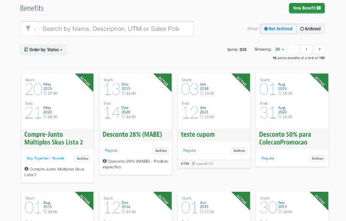
Promotions listing
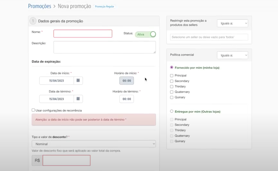
Promotions form
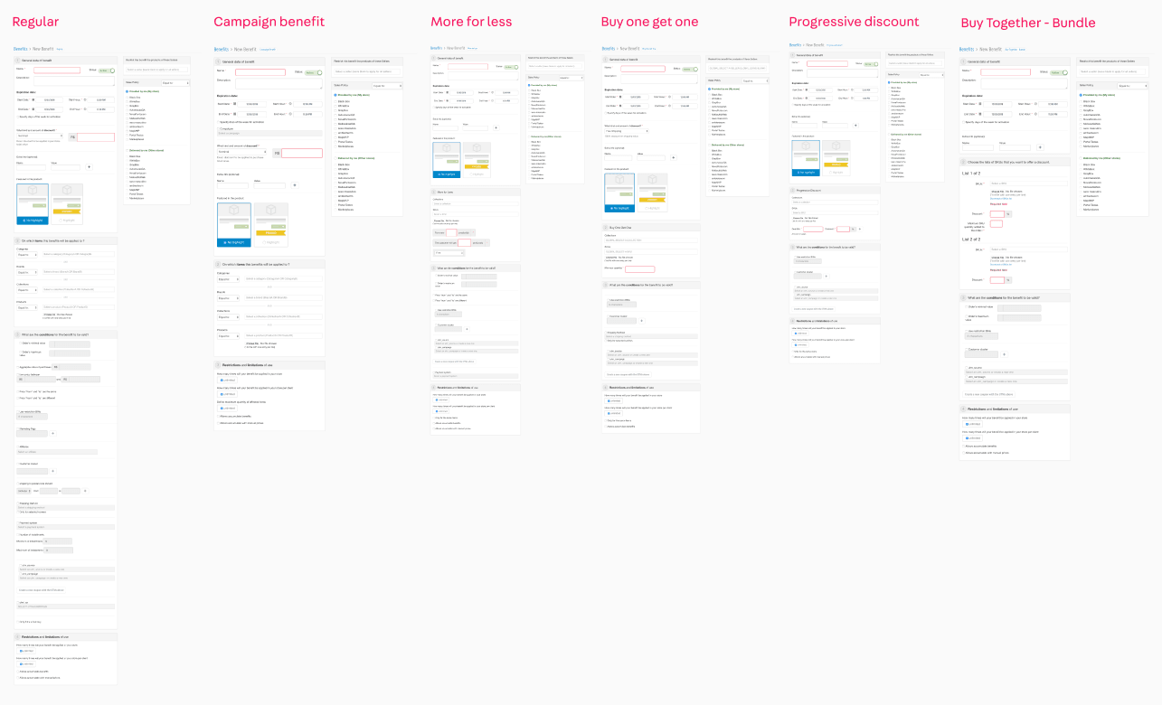
All forms
Discovery process
A large survey was started to understand the current status of the module and to have more context when defining the long-term goals of the module. To do this, some objectives were defined:
✤ Understand the use cases and business needs.
✤ Understand how we are positioned in relation to the competition and what our advantages, differentials, and deficiencies are.
✤ Understand which challenges and opportunities we should prioritize.
✤ Know the personas that use our products.
✤ Gain perspective on the future of the tool and align it with users' expectations.
Notion documentation
After some interviews with customers, analysis of previous studies, benchmarking and data analysis, and other studies, we had learned a few lessons.
✤ The vision of the future of the team and the interviewees is totally aligned: evolutions to supply omnichannel demands, flexibilization of some promotional rules, visibility of the competition and promotion accumulation, and security alerts about undesired prices.
✤ In fact, the module is already quite complete in features, standing out from the competition and being one of the “flagships” in the platform’s sales pitches.
✤ There were some functionality improvements that could be done.
✤ The amount of functionality, however, negatively impacts its ease of use. It’s not considered intuitive; it generates many doubts, which sometimes even lead the user to make mistakes that can be financially disastrous or not leverage a feature because they did not find it.
✤ Therefore, we must re-evaluate the business needs with the product's actual functioning to ensure that
✦ Merchants can easily and intuitively create their desired rules.
✦ Merchants understand the product behavior (the process of creating a promotion + how the specific promotion is selected for applicability).
Our mission is to allow the merchant to operationalize his promotion strategy with clarity of settings and functionality through an agile and user-friendly experience.
Miro documentation
Photo by christian buehner on Unsplash
For whom are we building a new experience?
Meet Rodrigo Silveira, ecommerce analyst, 25 years old, our persona.
He's currently attending a graduate course at a renowned university and is about to graduate this year. He lives alone and has a dog and enjoys going out and traveling with friends. He has been working with e-commerce for 2 years and is very interested in the area.
He's currently attending a graduate course at a renowned university and is about to graduate this year. He lives alone and has a dog and enjoys going out and traveling with friends. He has been working with e-commerce for 2 years and is very interested in the area.
Pains and needs:
✤ An interface that helps you create your promotions in an easy and agile way.
✤ A module that ensures the security and effectiveness of what is being done,
preventing the user from erroneous and harmful actions to the company.
✤ An interface that guarantees autonomy, without the need for technical people to perform specific configurations.
✤ Visibility of what happens with promotions, how they compete, and how they accumulate.
✤ Consistency and predictability of behavior and functionality within the module.
What do we build?
The new experience proposes a clearer and more objective interface, based on the standards of the VTEX design system. As previously mentioned, one of the biggest pain points is the high complexity of filling out the form and also being sure that the promotion will work as expected, and based on research conducted during the process, we were able to change the taxonomy, information architecture, and structure of the form to provide more clarity of the possible actions to be done. Compared to the old form, we gained in fluidity, clarity, usability, and assurance that the promotion was set up correctly.
Some improvements:
✤ Consistent experience: the latest standards of the VTEX design system were followed in order to contribute to consistency across modules, an important point
for the company's entry into the North American and European markets.
✤ More dynamic and intelligent form: based on the usage data collected in Amplitude and FullStory, it was proposed that a more agile and targeted information hierarchy be created; features and settings that are used the most appear first and are already selected by default. In addition, only the actions that will be filled are visible, helping the user to keep focused on his main task.
New list
The legacy list was a big square grid with a hard-to-read font size, a lot of information, and vivid colors. The new solution has a more accessible visual and makes better use of the list space using the table component of the design system.
New form
The current form is divided into 6 promotion types. There is little difference in the functionality and look of each of them. In general, they are all very long and full of information (you can check the previous image), which makes it difficult for the user to understand and use. The new solution is a unique and adaptable form, which already comes with the most used information preselected.
What's going on now?
The new listing was just implemented and got a CES of 60%, a big improvement compared to the old listing's CES of 28%. Based on the feedback received from the closed beta surveys, it was possible to improve the overall experience. Currently, the team is working on implementing the unified form and has a version almost ready to start a closed beta.
That's all, folks!
