Education changes lives
Gran is one of Brazil's largest edtechs. Design runs as a shared pool supporting 8 squads organized by microservices in a horizontal, cross-team setup. Without a common system, each squad shipped its own take on the interface, so the same button, color, or type size lived in dozens of slightly different versions.
Scaling design
How we transformed fragmented design decisions into a shared design language through semantic tokens, governance, and cross-functional collaboration.
Gran has product development distributed across eight independent squads. As the company grew, each team evolved its own UI patterns, components, and visual language independently. While these decisions solved local needs, they gradually fragmented the experience (creating a Frankenstein) and increased the cost of building and maintaining products.
Granberry was created to establish a shared design language capable of scaling with the organization rather than individual teams.
Results
✦ 60+ interfaces audited
✦ 8 product squads aligned
✦ 55+ color values consolidated into semantic tokens
✦ typography styles standardized
Gran has product development distributed across eight independent squads. As the company grew, each team evolved its own UI patterns, components, and visual language independently. While these decisions solved local needs, they gradually fragmented the experience (creating a Frankenstein) and increased the cost of building and maintaining products.
Granberry was created to establish a shared design language capable of scaling with the organization rather than individual teams.
Results
✦ 60+ interfaces audited
✦ 8 product squads aligned
✦ 55+ color values consolidated into semantic tokens
✦ typography styles standardized
Everyone was building the same thing twice
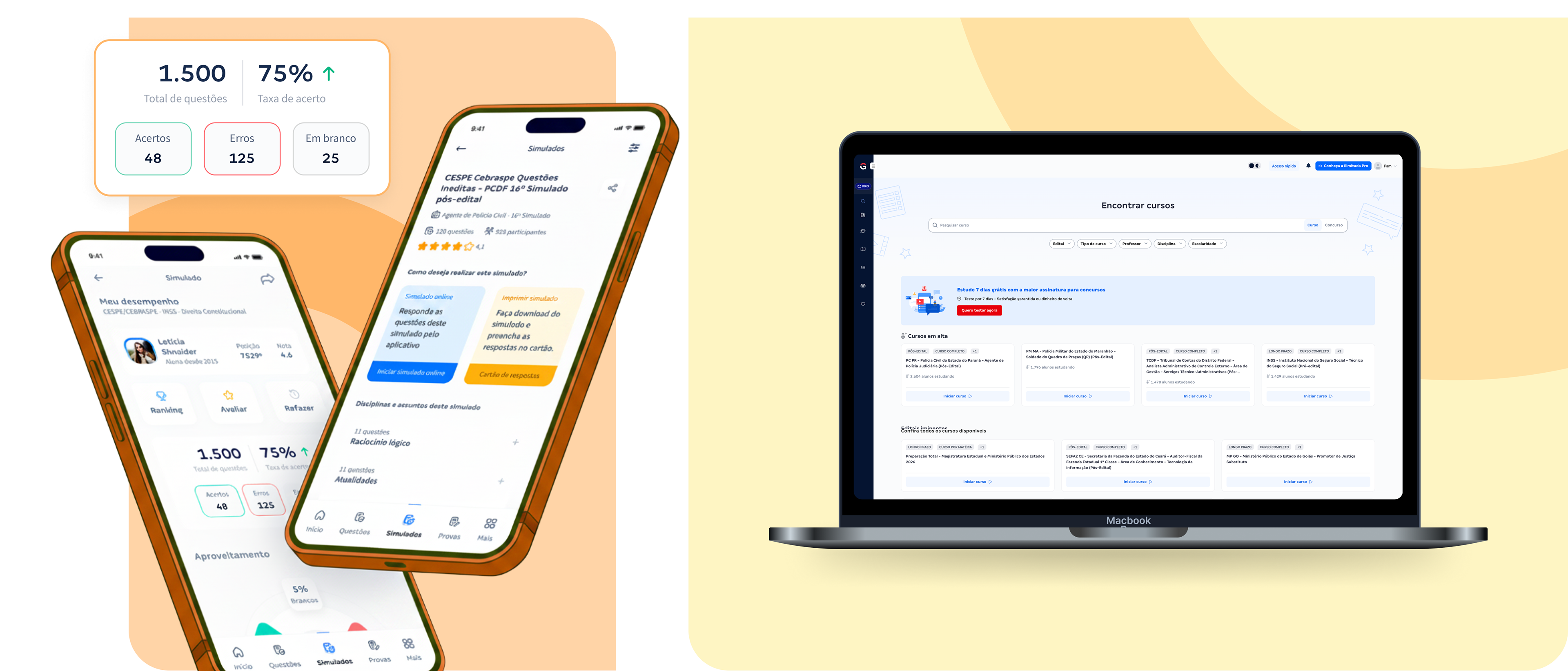
Before building a design system, we needed to understand the scale of inconsistency. We audited more than 60 interfaces across 10+ products and discovered that teams weren’t solving different problems. They were solving the same problems differently.
Audit highlights
✦ 60+ interfaces reviewed
✦ 55+ independent color values
✦ Six typography systems
✦ Multiple versions of the same components
✦ No shared naming conventions
Audit highlights
✦ 60+ interfaces reviewed
✦ 55+ independent color values
✦ Six typography systems
✦ Multiple versions of the same components
✦ No shared naming conventions
Building a shared language instead of another UI kit
Granberry wasn’t designed as a component library. It was designed as the common language between design and engineering. I co-led the initiative from discovery through implementation, defining semantic tokens, foundations, atomic design architecture, iconography, and accessibility standards while collaborating closely with product, engineering, marketing, and QA.
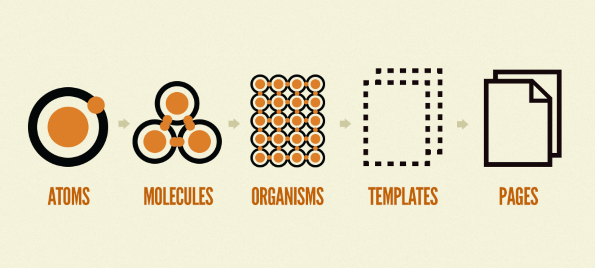
We adapted Atomic Design to fit our context, keeping only the layers that created value. Every component followed the same lifecycle before becoming part of the shared library.
Research → Design → Validation → Collaboration → Documentation
Research → Design → Validation → Collaboration → Documentation
→ Pilot rollout → Production
Nothing became a standard until it proved itself in a real product.
Nothing became a standard until it proved itself in a real product.
Separate design decisions from implementation
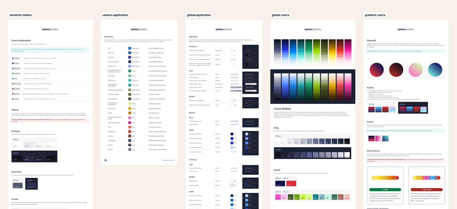
The biggest transformation wasn’t reusable components; it was semantic tokens.
Instead of hardcoding values like #212121, components reference semantic decisions such as color. text.primary. This abstraction allows a single design decision to scale consistently across web, mobile, TV, dark mode, and future white-label products while keeping design and engineering synchronized.
As the system matured, we adopted Tokens Studio to improve versioning, organization, and cross-platform synchronization using AI.
Design governance that could scale
A design system only succeeds if teams continue using and evolving it. Instead of centralizing ownership, we created a governance model that encouraged collaboration while maintaining quality. Every contribution followed the same process before becoming part of the shared language, allowing Granberry to evolve continuously without becoming a bottleneck.
Governance included
✦ Bi-weekly Design Critiques
✦ Contribution guidelines
✦ Documentation standards
✦ Assisted rollout in pilot products
✦ Storybook documentation for React, Vue, and Flutter
✦ Public backlog, release notes, and migration planning
Granberry is the process through which design decisions were made.
Governance included
✦ Bi-weekly Design Critiques
✦ Contribution guidelines
✦ Documentation standards
✦ Assisted rollout in pilot products
✦ Storybook documentation for React, Vue, and Flutter
✦ Public backlog, release notes, and migration planning
Granberry is the process through which design decisions were made.
Balancing today’s product with tomorrow’s vision
One of the most complex challenges wasn’t creating components. It was maintaining two libraries simultaneously, one looking to the present and the other to the future.
The Live Library supported designers shipping production features every day, while the Core Library became the space to validate and evolve future components before release. Keeping both synchronized across web, mobile, responsive breakpoints, and multiple frameworks required continuous governance, careful versioning, and close collaboration with engineering.
The Live Library supported designers shipping production features every day, while the Core Library became the space to validate and evolve future components before release. Keeping both synchronized across web, mobile, responsive breakpoints, and multiple frameworks required continuous governance, careful versioning, and close collaboration with engineering.
Using AI where it created leverage
Rather than generating interfaces, we used AI to reduce repetitive work. It accelerated research synthesis, documentation, and the first drafts of usage guidelines, allowing documentation to evolve alongside the design system. We also explored workflows connecting Tokens Studio with AI-assisted code generation to reduce manual synchronization between design tokens and implementation.
Rather than generating interfaces, we used AI to reduce repetitive work. It accelerated research synthesis, documentation, and the first drafts of usage guidelines, allowing documentation to evolve alongside the design system. We also explored workflows connecting Tokens Studio with AI-assisted code generation to reduce manual synchronization between design tokens and implementation.
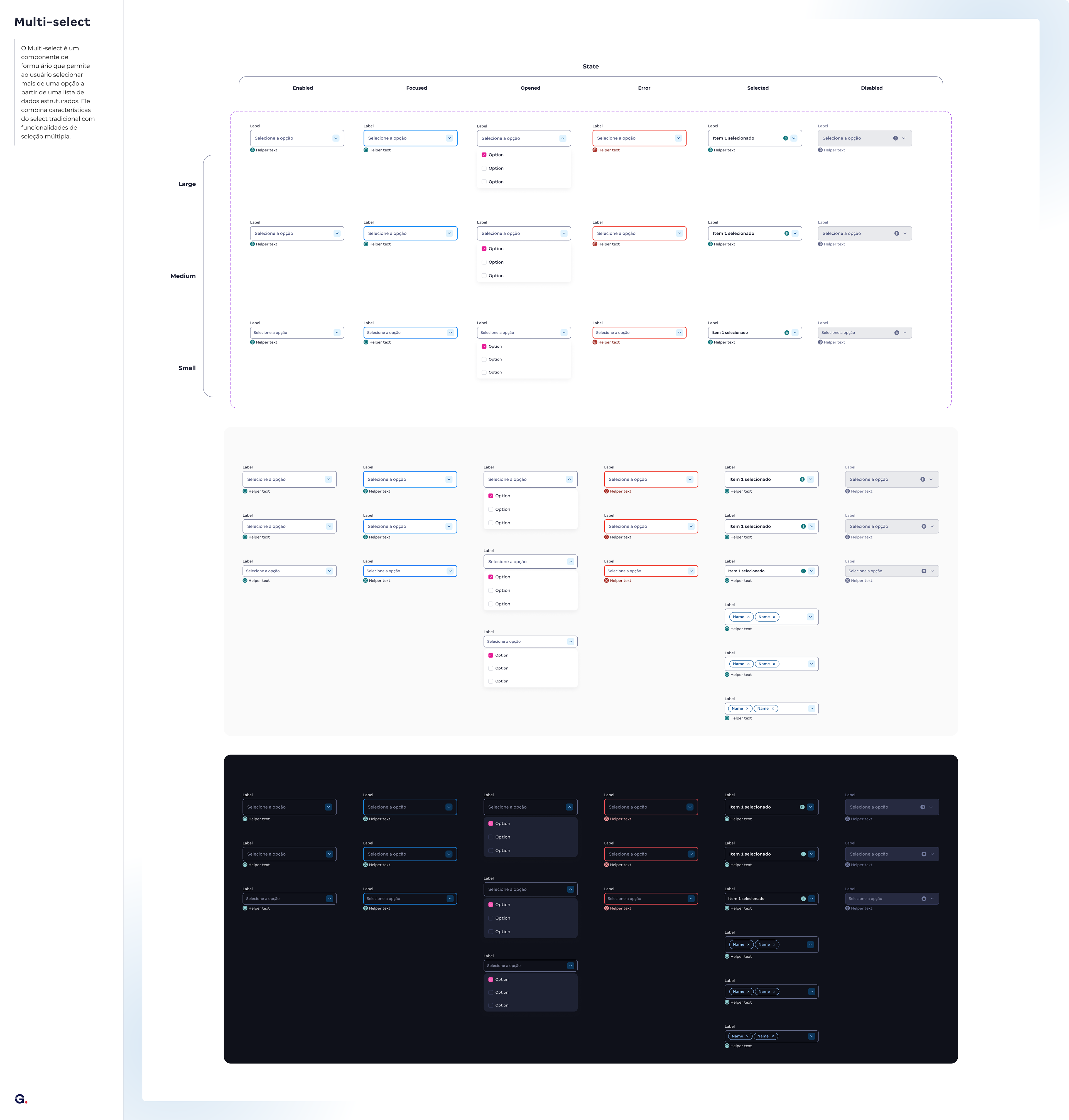
Figma documentation
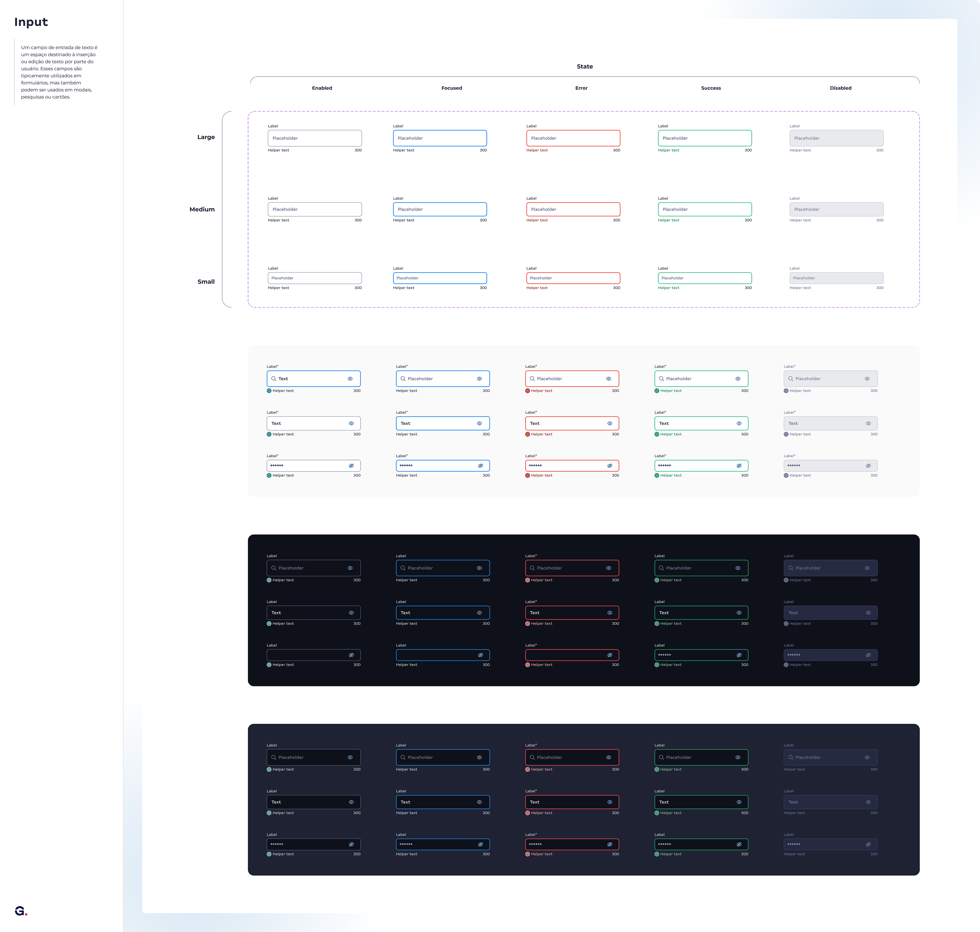
Figma documentation
Measuring success
Granberry is still expanding across Gran’s ecosystem, so long-term business metrics continue to evolve. From the beginning, however, the initiative was designed around operational outcomes rather than visual consistency alone.
Success metrics
✦ Faster onboarding for designers and engineers
✦ Shorter delivery cycles
✦ Less design and engineering rework
✦ Lower maintenance costs
✦ Faster time-to-market
✦ Higher consistency across products
✦ Better scalability for future platforms
Success metrics
✦ Faster onboarding for designers and engineers
✦ Shorter delivery cycles
✦ Less design and engineering rework
✦ Lower maintenance costs
✦ Faster time-to-market
✦ Higher consistency across products
✦ Better scalability for future platforms
An evolving product
Granberry was never intended to be a one-time delivery. Instead of a large release, we adopted continuous rollout, validating new foundations and components inside production before expanding them across the ecosystem.
Today, documentation is available through Storybook for React, Vue, and Flutter, while the public Granberry portal continues to evolve with principles, documentation, onboarding materials, and contribution guidelines.
Granberry continues to evolve, one design decision at a time.
Today, documentation is available through Storybook for React, Vue, and Flutter, while the public Granberry portal continues to evolve with principles, documentation, onboarding materials, and contribution guidelines.
Granberry continues to evolve, one design decision at a time.
How does Granberry look?
The checkout is the best example of the library in action. Because it's a critical, state-heavy journey (error, empty, loading, selection), it asks a lot of the system, and that's exactly where Granberry shines: the components and tokens already handle those states, so the work becomes composing instead of reinventing.
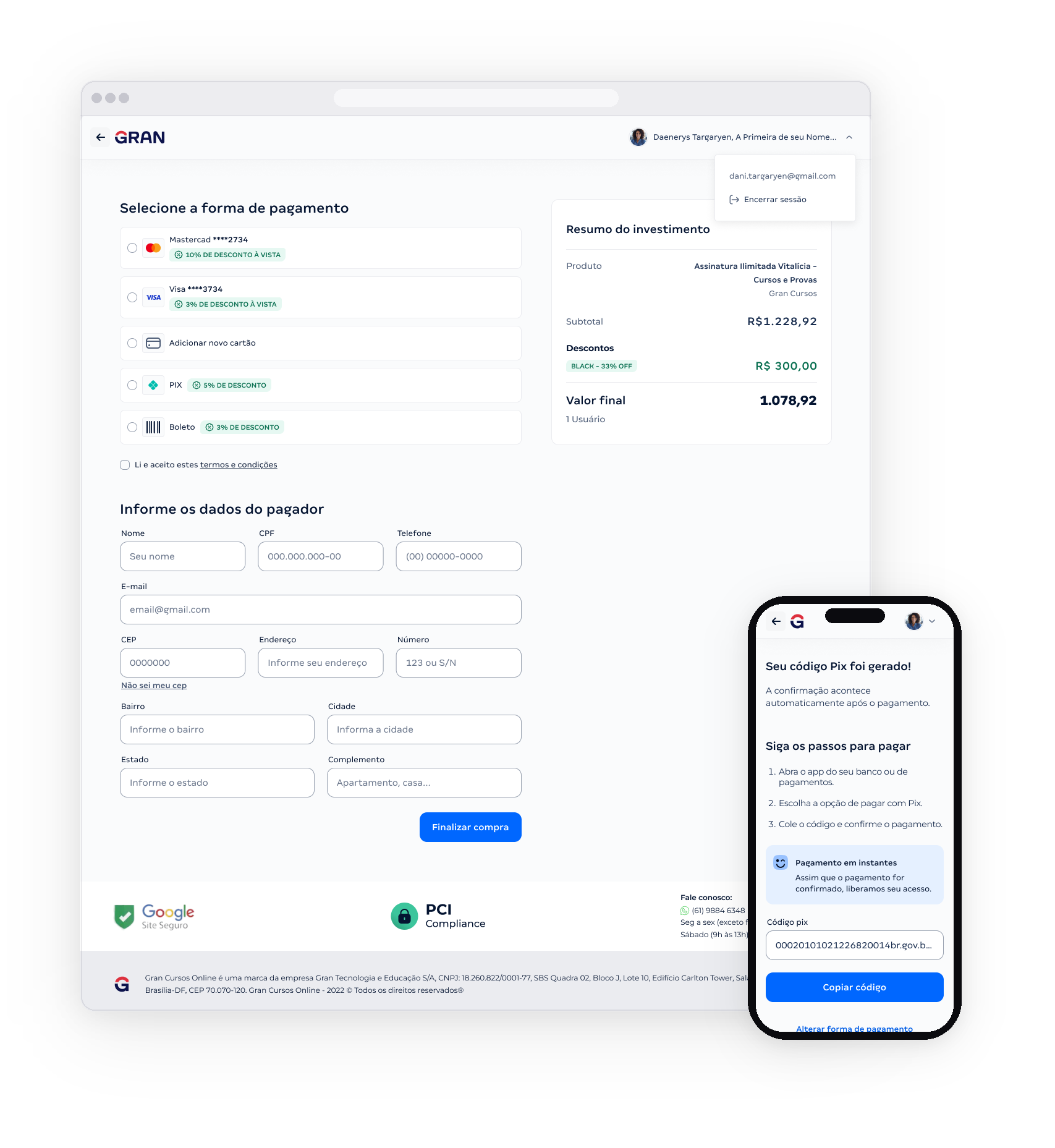
Tela inicial do checkout // Modo claro
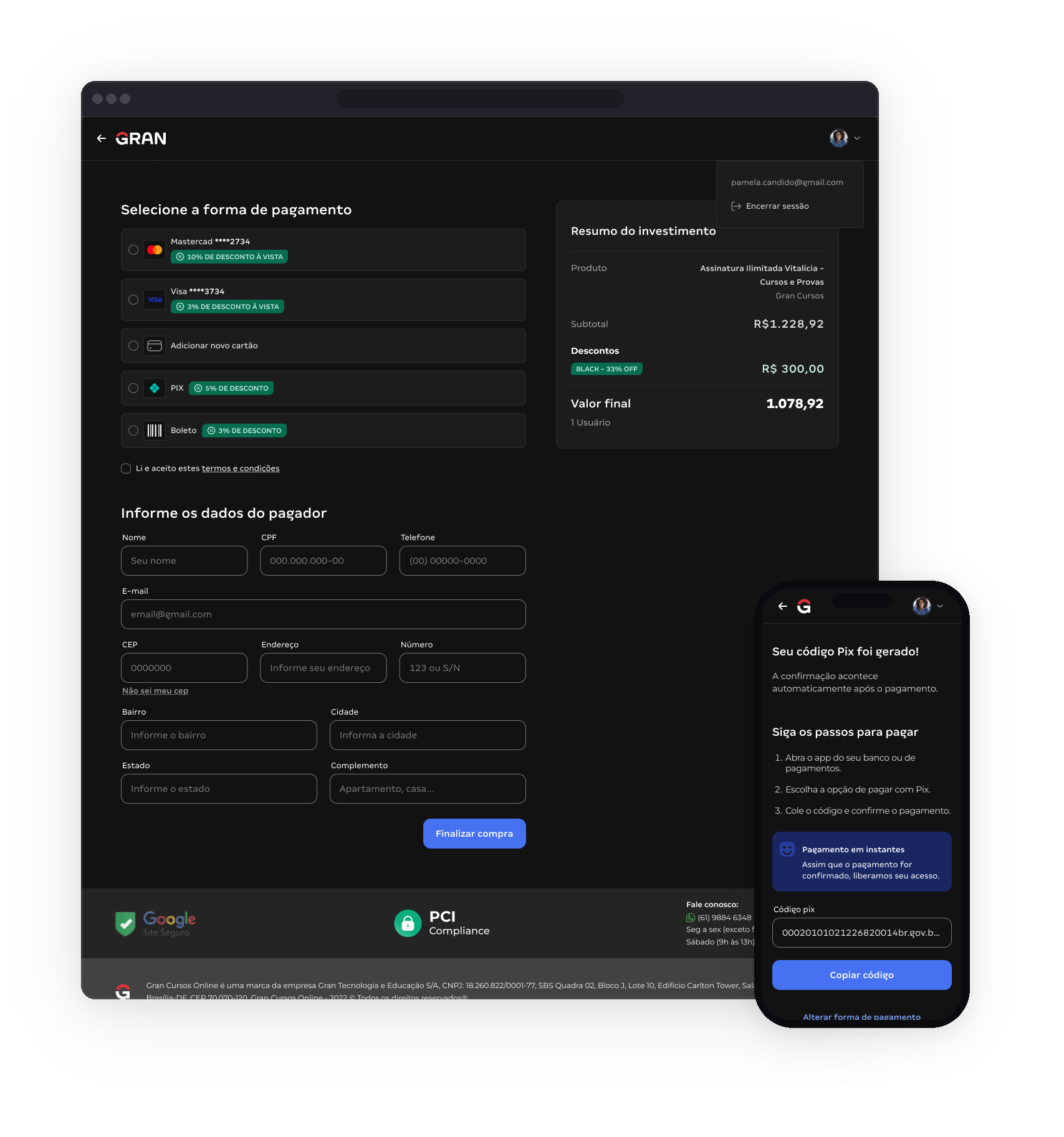
Tela inicial do checkout // Modo escuro
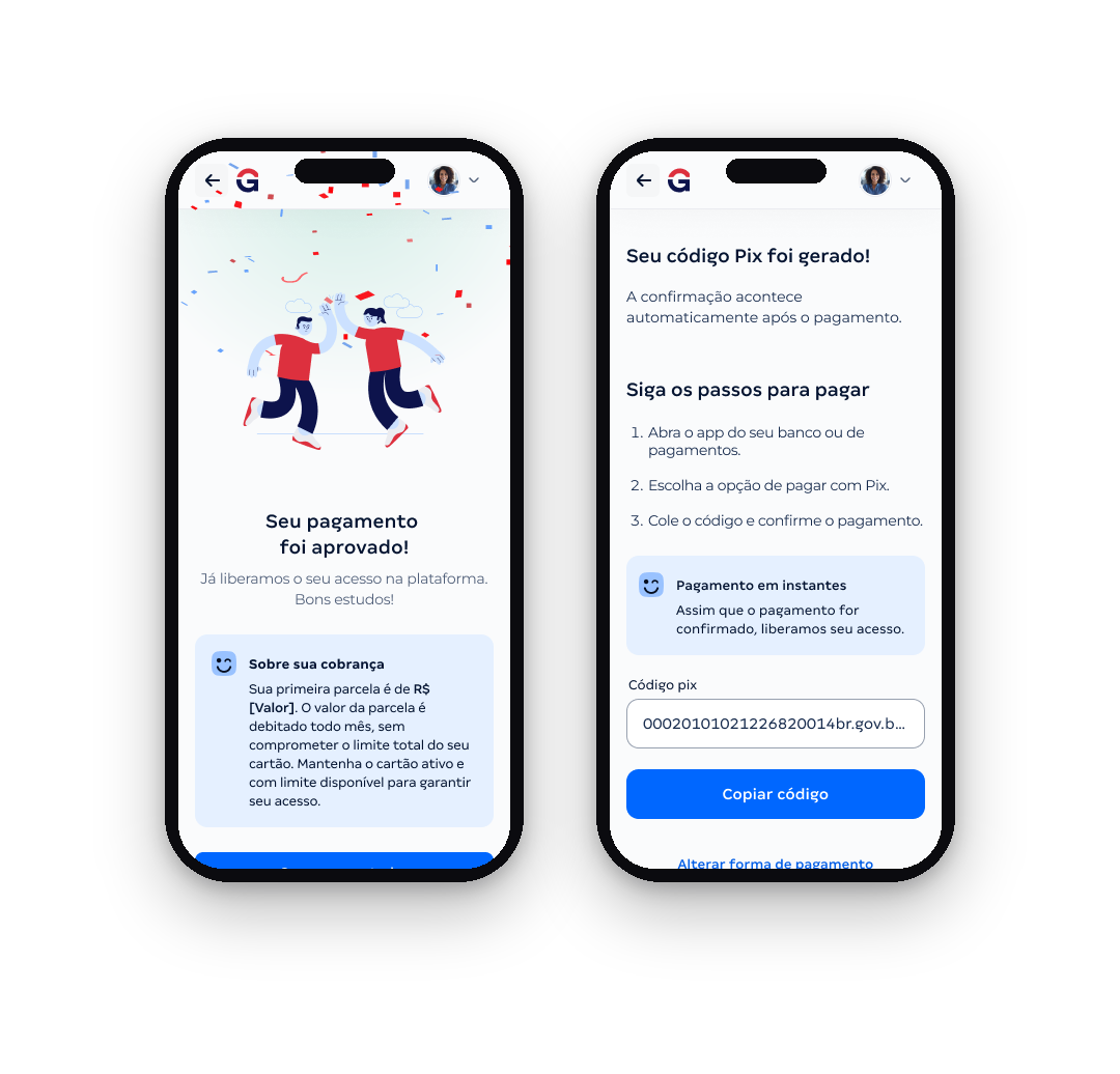
Tela de sucesso e Pix gerado // Modo claro
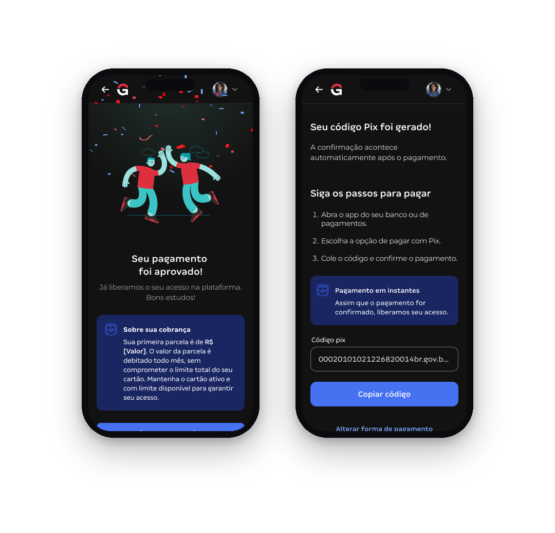
Tela de sucesso e Pix gerado // Modo escuro
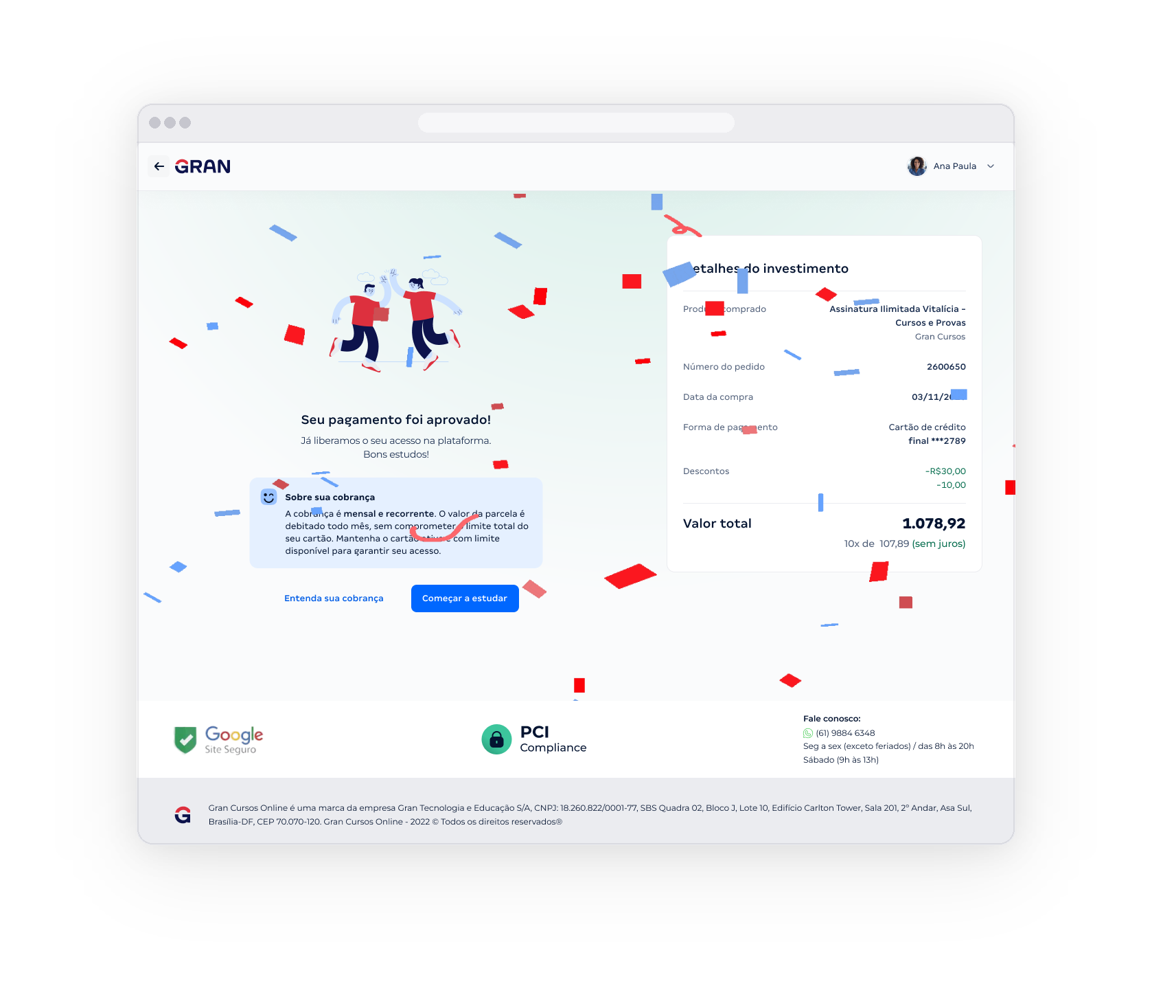
Tela de sucesso // Modo claro
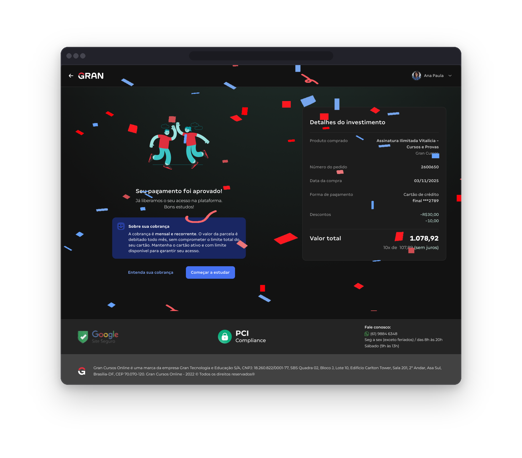
Tela de sucesso // Modo escuro
Dream team
“In nature, nothing exists alone.” — Rachel Carson
I co-created this project alongside a brilliant, multidisciplinary team of designers, PMs, and developers. Our strength was in active collaboration, aligning quickly, learning fast, and iterating often.